Beyond the Plate: The Psychology and Science of High-Yield Menu Design
/
When opening or running a restaurant, operators pour immense energy into recipes, interior décor, and staff training. Yet, they frequently treat the menu as an afterthought, a basic checklist of dishes and prices. In reality, a menu is not just a piece of paper; it is your silent salesperson. Designed well, it guides choices, increases profitability, and elevates the guest experience. Designed poorly, it creates decision paralysis, frustrates diners, and leaks revenue. In fact, menu engineering—the strategic combination of psychology, layout structure, and positioning—has been shown to increase overall restaurant profitability by up to 15% without altering a single price point.
1. Eliminate Menu Bloat: The 7-to-10 Rule A massive mistake many rookie restaurateurs make is trying to offer something for everyone, resulting in crowded menus. Too many options cause cognitive overload and decision fatigue. Overwhelmed guests panic and default to safe, low-margin options rather than exploring higher-value signature items. Keep individual categories limited strictly to 7 to 10 items. Break lists down logically into intuitive, themed sections such as Brunch Favourites, Lighter Bites, or Sweet Treats. This structuring reduces cognitive load, speeds up table turnover, and helps diners order with confidence.
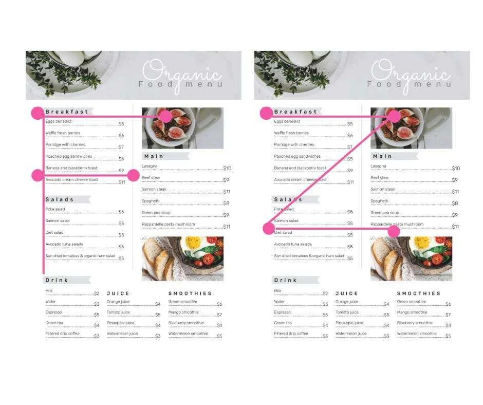
2. Design for Layout Hotspots and Gaze Motion Theory Diners do not read menus cover-to-cover like a book; they scan them rapidly. Eye-tracking neuroscience proves that guests typically follow F-shaped or Z-shaped visual patterns.
Capitalise on Prime Real Estate: Diners’ eyes naturally land on hotspots first—top-left, top-centre, and bottom-right areas of a page. For cultures reading right to left, this reverses to the top-right. Place your highest-margin, brand-aligned dishes in these zones. Avoid burying them in low-attention areas like the middle-left.
Master the Primacy & Recency Effects: Diners remember the first and last items listed in any section. Position a high-margin signature dish at the top and another irresistible upgrade at the bottom. Place low-margin utility dishes in the middle where they won’t steal focus.
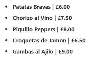
3. Subvert Pricing Friction How a price is positioned alters perception. The goal is to keep focus on the culinary experience rather than the transaction.
Keep the price close to the description, formatting it as a unified offer.
Premium venues often drop currency signs and use rounded numbers (e.g., 17 instead of £17.00). This strips away spending triggers and signals confidence.
Place high-margin dishes next to expensive specials. A £18 pasta looks appealing when adjacent to a £24 seafood special.
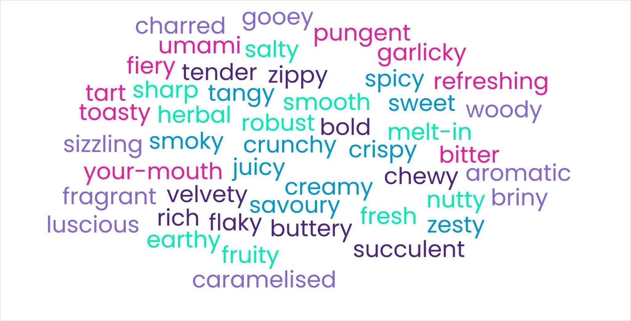
4. Deploy High-Impact Sensory Descriptors Storytelling directly impacts perceived value. Updating wording makes dishes more enticing.
Replace generic terms: “Roasted Chicken” becomes “Juicy, tender chicken with a crispy golden crust.”
Use vivid words detailing textures, preparation methods, and sourcing origins. Guests are up to 56% more likely to order when descriptions are sensory-rich.
Avoid uninspired or overused terms like good, nice, foodie, yummy, mouthfeel, or moist.
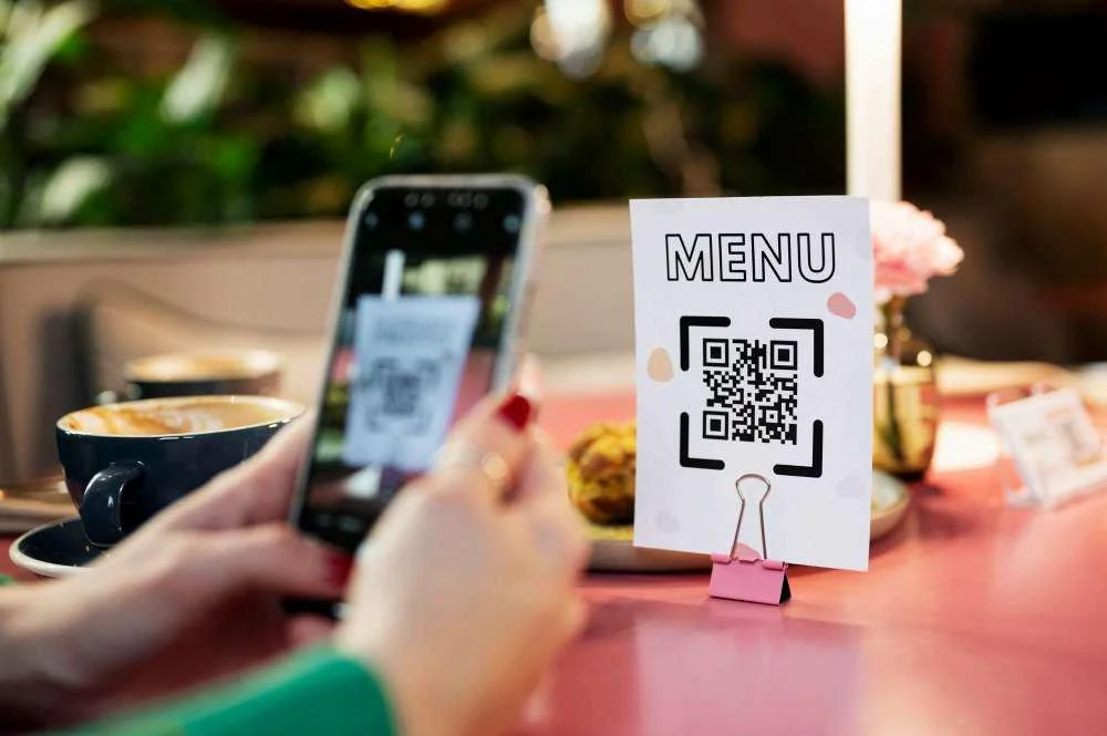
5. Adopt a Phygital and Transparent Mindset Modern diners, especially Gen Z, expect convenience and visibility.
Provide both physical and digital menus. QR codes are useful, but relying solely on digital is risky due to lighting, Wi-Fi, or preference.
Digital menus should be responsive HTML with clear headings, text contrast, and schema tags for accessibility and search verification.
Highlight dietary restrictions, calorie counts, allergen alerts, and sustainable sourcing metrics directly on the menu.
Final Checks Before printing or publishing, conduct a physical environment test. Review the menu in the actual dining space under service lighting. If contrast is too soft, text forces squinting, or layout causes hesitation, the design is costing you orders.